What is a Dashboard?
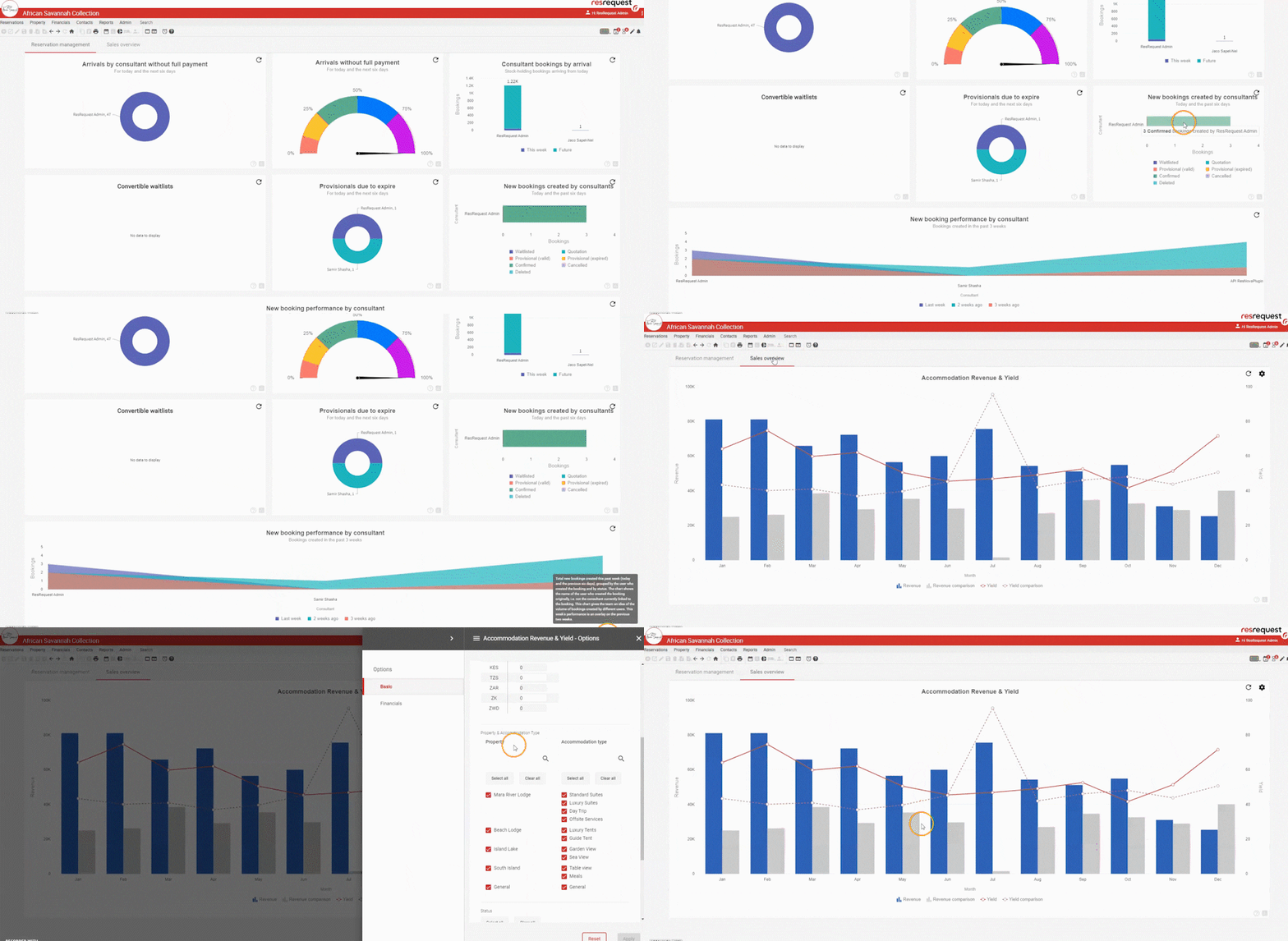
A Dashboard shows a number of charts that help you visualise patterns of performance and productivity so you can understand and improve your business inputs and performance. Using dashboards will help you see performance in significant operational areas. When you see patterns and trends you can adjust your inputs for better productivity and profitability.
What is a Dashboard Worksheet?
A Dashboard consists of a number of graphs, we’re grouping dashboard graphs into your key business areas. Each business area will be on a separate worksheet, or tab, like Excel or Google Sheets. Here’s what it will look like once we’ve added a few more:
Why use charts?
It’s often easier to spot trends and patterns in graphs and charts than by simply looking through a long table of data, especially for big datasets, so one of the common uses of chart tools is in simply coming to grips with what a new dataset actually means. The benefits of charts and graphs also come into play in presentations, where they can be used to quickly illustrate trends in data for others to see.
A chart can create a clearer picture of a set of data values than a table with rows of numbers in it, allowing managers to incorporate this understanding into analysis and future planning.

